Personalize Your Campaign to Reach Global Markets
The graphic design concepts pertain to local and global markets, demonstrating an understanding of community, environmental, and social issues. These designs offer insights into ethical, cross-cultural, and community design principles and practices.
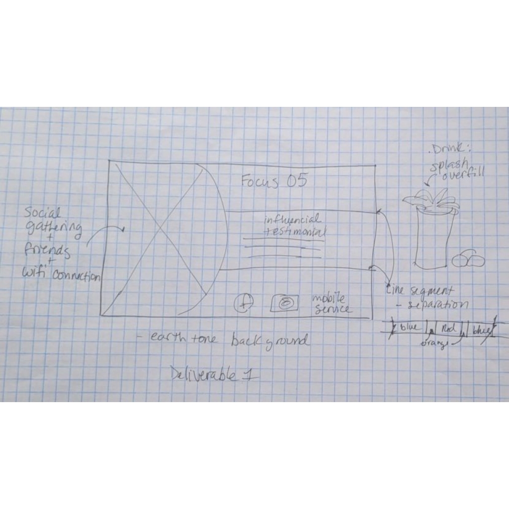
Focus 05 Restaurant
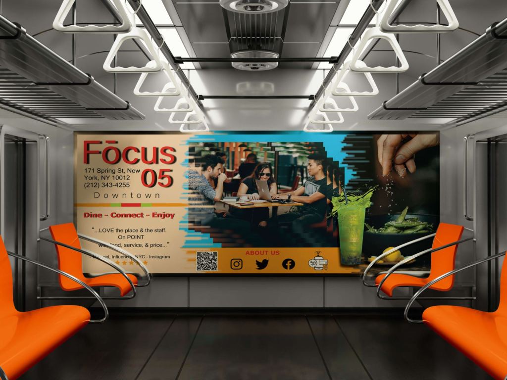
Focus 05 restaurant offers a leisurely atmosphere that encourages both dining and using technology, providing comfort and Wi-Fi access.
Problem
Focus 05 wants to create a subway advertisement for the interior car cards, posters, or billboards to attract a younger, diverse audience and increase traffic. The ad must connect with millennials, attract them to its restaurant, establish credibility, and gain their trust. It must emphasize the restaurant’s sustainable services and features to convey a pleasant, inviting dining experience.
Process
Extensive research and planning assist the project by involving multiple iteration stages and focus groups to establish the design. The theme promotes the millennial culture.
Concept: healthy energy + techy vibe + trust = millennial
Bright colors show millennial culture. Green represents a healthy lifestyle, while orange, red, and blue reflect energy and adventure. The visual effects and icons suggest a focus on technology. Social media reviews build trust and strengthen the connection between the restaurant and its audience.


This mood board conveys preferred colors, lifestyle, and attitudes that resonate with the millennial language and culture.
Solution
The design creates three distinctive, fun, and energetic vibes that reflect diversity and confidence. A human-centered design approach focuses on users’ needs. This process involves optical illusions and patterns to enhance visual interest. Some concepts update the logo to make it bolder, catering to the millennial culture. The rebrand emphasizes the playful nature of the restaurant’s name by creating a focal point with its thick and thin letters, helping the target audience notice and remember the restaurant.


Three design variations
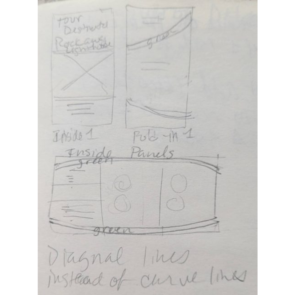
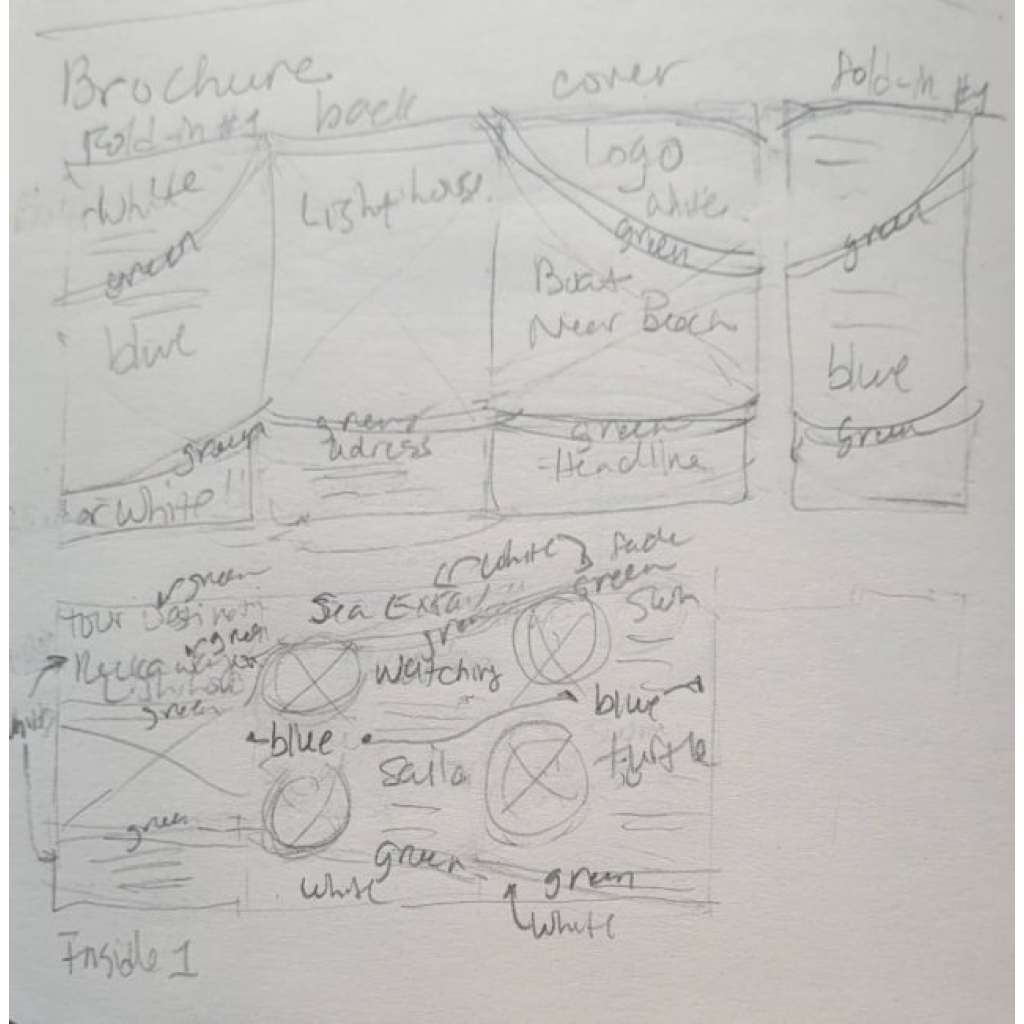
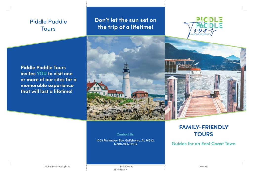
Piddle Paddle Tours

Piddle Paddle Tours offers boat tours and rentals for tourists and residents.
Problem
The company seeks a brochure that is easy to carry, designed to attract a diverse range of customers and tourists to its services. It is essential to consider that this brochure and print advertising approach will be an integral part of the long-term marketing strategy and serve as a keepsake.
Process
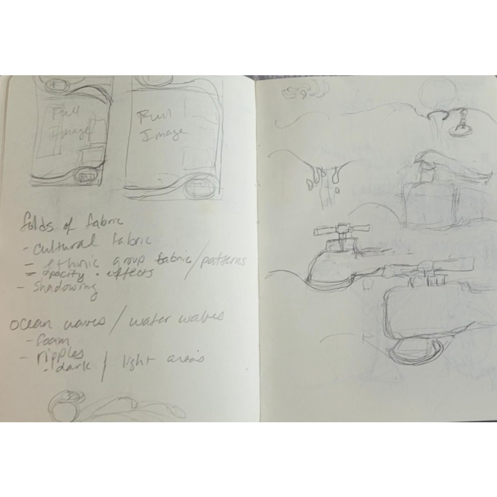
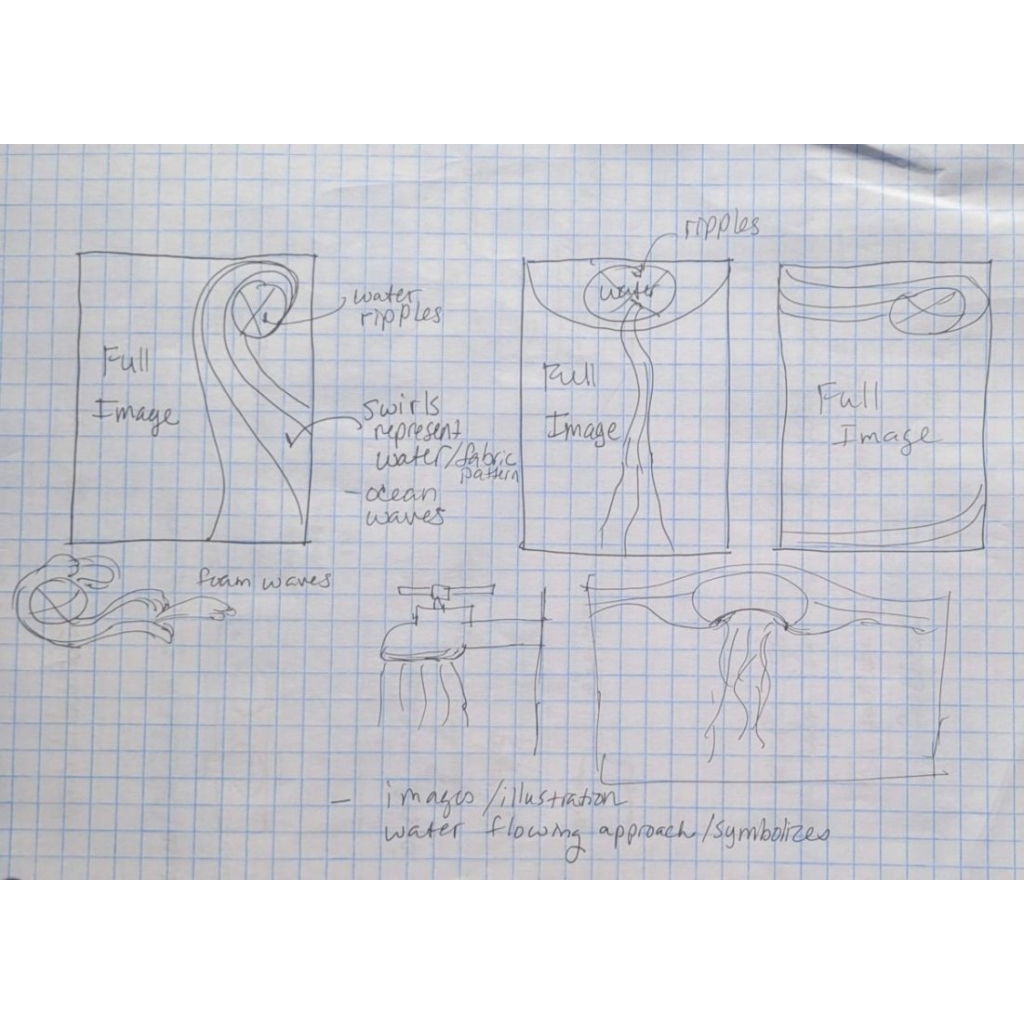
The iteration process involves researching the target audience and competitors. The design approach uses an easy-to-read format with engaging movements and patterns, creating a theme that reflects the company, its target audience, and the market.
Concept: movement + central attention + waves = fun attractions
Geometric shapes represent movement by arranging them in unique patterns. Circular shapes draw attention, while colors, continuous lines, and forms evoke the vast ocean and its waves.
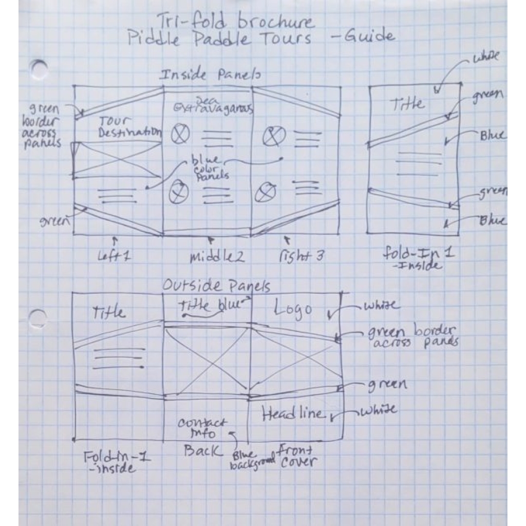
Solution
The triangular form of the tri-fold brochure signifies sharpness and dynamic movement, making it more distinctive and appealing than other brochures. Bold sea colors symbolize the ocean, waves, and water. The idea highlights the fun and adventurous experiences offered by boat tours, making Piddle Paddle Tours one of the most popular, unique, and enjoyable tourist attractions.

Vietnam Clean Water Initiative
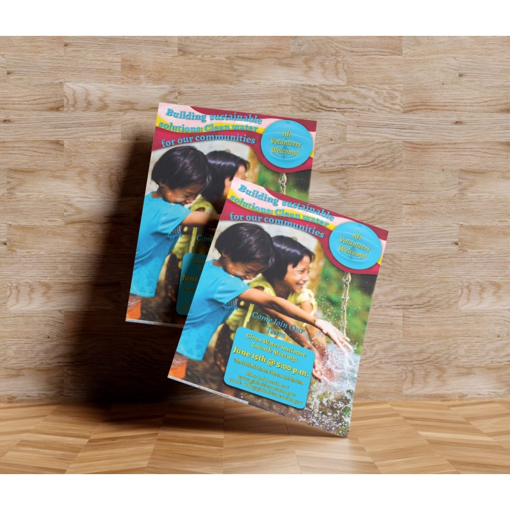
The Global Clean Water Initiative provides sustainable clean water solutions to communities across various countries.
Problem
The company wants a flyer to attract volunteers from nearby communities throughout Vietnam, encouraging them to participate and find sustainable, clean water solutions that suit their needs. It needs to align with Vietnam’s cultural and societal values, beliefs, and traditions, targeting diverse marginal ethnic groups.
Process
Cross-cultural and water industry research helps plan designs for cultural sensitivities and inclusion. The theme reflects the culture’s values and beliefs.
Concept: family + culture + water = participation
A culturally sensitive image captures family values and highlights the joy of having clean water. Cultural colors depicted in waves symbolize the movement of water, excitement, and prosperity. They represent a fresh start and a brighter future, leading to greater participation.
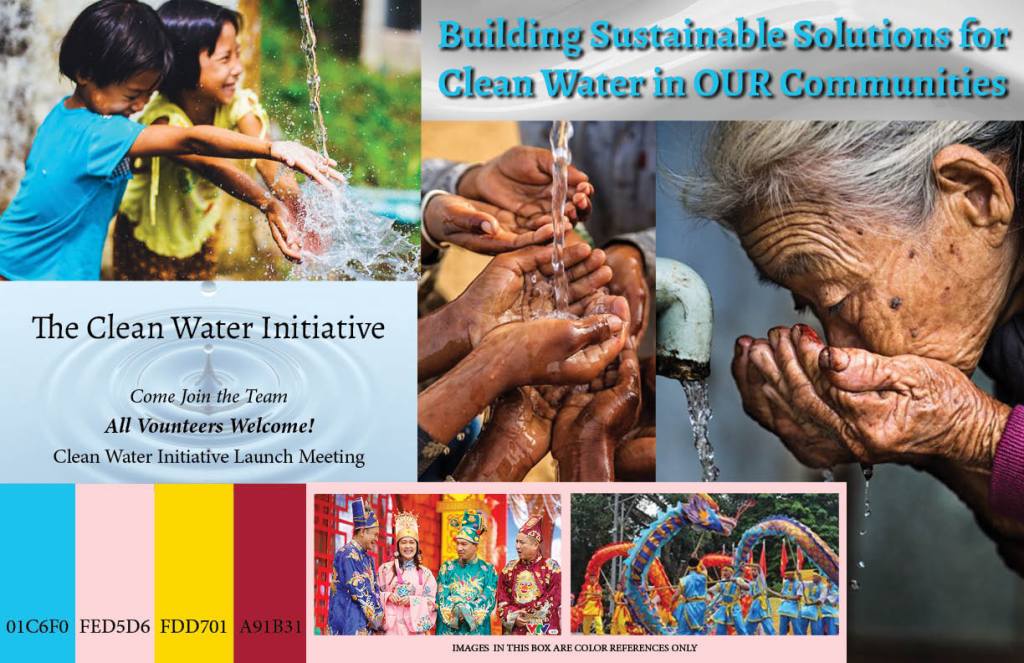

Solution
The cultural design features a bold, fun, and happy scene that captivates communities with its vibrant colors and inviting visuals. It incorporates curves that represent the fluidity of flowing water, joy, and hope, with shapes that emphasize embracing family and communities. The message indicates that volunteers can help provide clean water to their communities. Their efforts ensure that fresh, clean water “pours” for everyone.

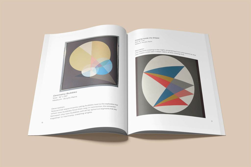
Metromoheim Museum Art Talk Collection Exhibition
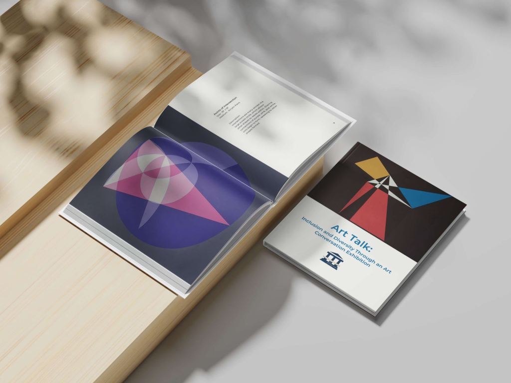
The Metromoheim Museum curates diverse collections of domestic and international artists.
Problem
The Metromoheim Museum aims to create a digital catalog featuring one of its curated artists’ collections as part of its long-term marketing strategy. The design must use a grid structure to showcase the multi-page catalog while incorporating various composition techniques. It must effectively capture the artist’s collection and seamlessly integrate grid methods to create unique designs tailored for the client.
Process
Research and planning develop the design. Multiple iterations help produce a theme that resonates with the audience and highlights the artists’ collection.
Concept: openness + empathy + intriguing = art
A modern approach creates a sense of open space by arranging visual elements differently. It uses an empathy design strategy to connect with the audience while considering how bold arts impact their experience. It intrigues them with the structure, artwork, and layout.
Solution
The design layout and structure use simplicity and a minimalistic organizational approach, resulting in a sophisticated and professional look and feel. This design allows the artwork to take center stage, enhanced by subtle splashes of color and various font styles to distinguish it and engage the audience.


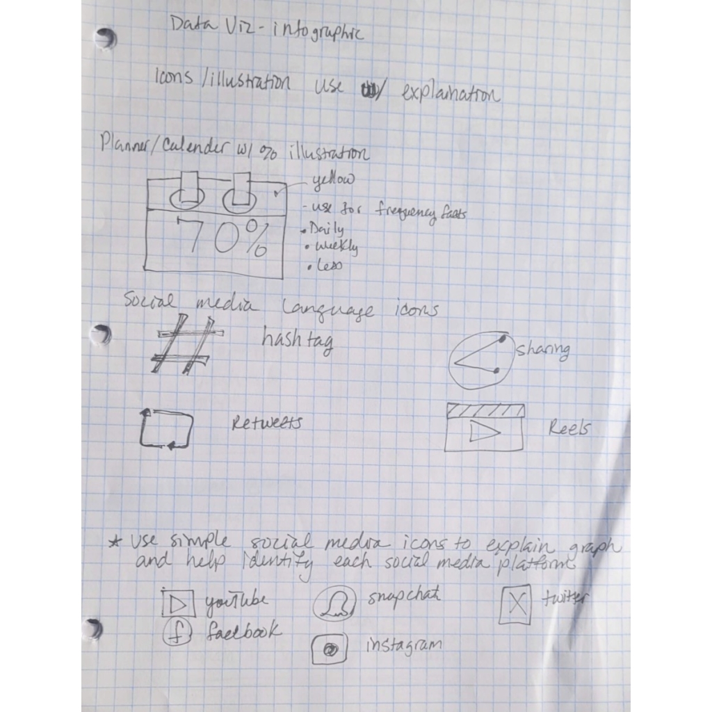
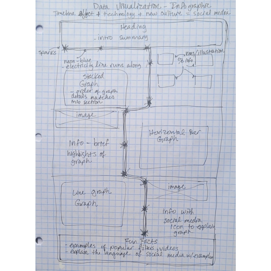
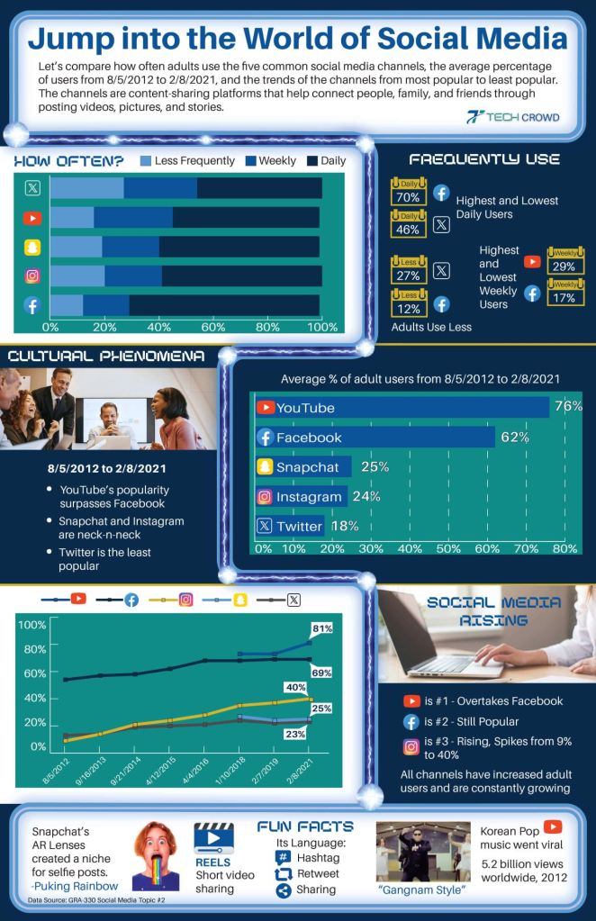
Tech Crowd Social Media Data Visualization

Tech Crowd is a magazine that produces articles about current technology and business.
Problem
The client wants data visualization in the form of infographics. It must effectively tell a story, be engaging and easy to understand, and adhere to approved typography, colors, logos, and design specifications. It must engage the audience with data and visual aids, such as graphs.
Process
Extensive research into the graphs and data visualization industries and styles helps with effective design planning methods by leveraging the evolving concept of social media. The theme conveys the data and aligns with objectives.
Concept: technology + data + personality = infographic
Cables, wires, electricity, and images represent technology. Various graphs and illustrations interpret the data, making it easy to understand. The brand colors, typography, and asymmetrical design provide the infographic with a distinct personality, creating dynamics and tension.
Solution
A fun and unique infographic is created using simple graphs and custom icon illustrations to help interpret the data reports, making it easy for the audience to understand and draw conclusions.
Music Talks with Children
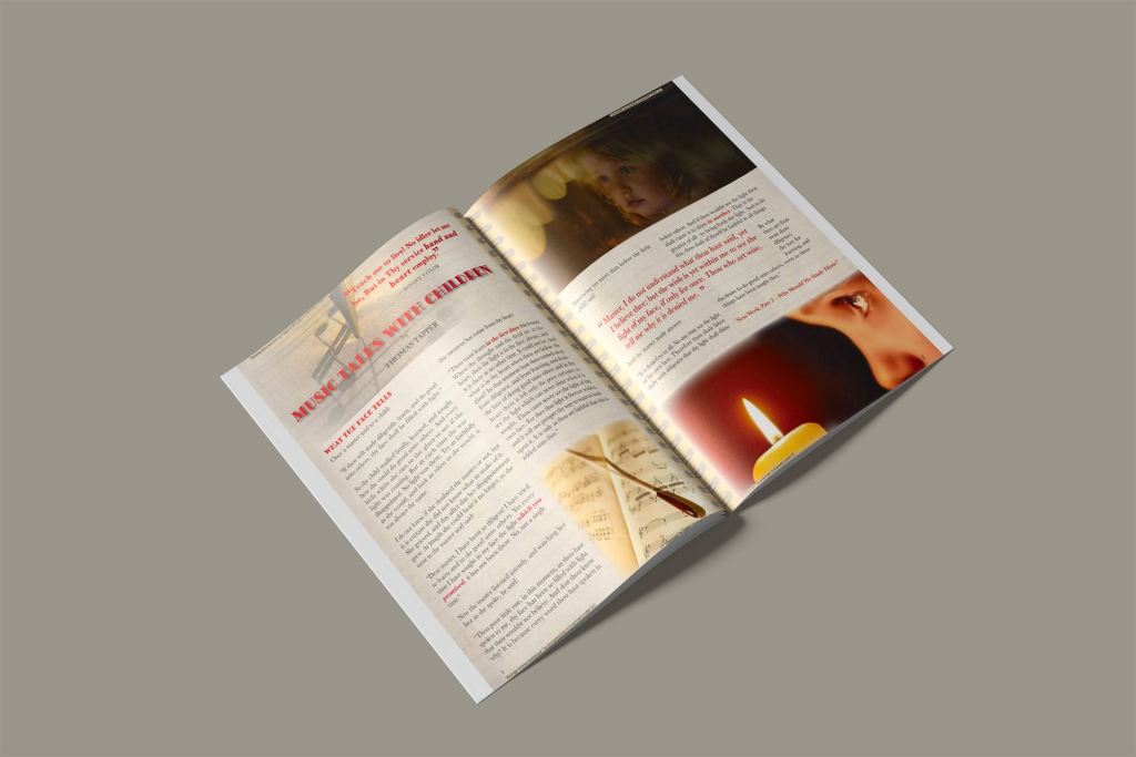
A magazine article that showcases narrative stories for its readers every week.
Problem
The design aims to create a positive article with a typeface pairing that features compositions, conveys personality, and engages the audience. It must utilize grids, remain readable, and promote continued reading.
Process
Typeface research and planning help select pairs that tell the story. The critical thinking process, combined with empathy, helps the design reach the target audience.
Concept: comfort + children + study = music talks
The warm candlelight, combined with the yellow and red colors, creates a comforting atmosphere. Pictures of children show the innocence and purity of learning. Notebooks and music sheets symbolize studying. This concept gives the story a timeless feel and adds personality. The serif typeface highlights the classic, traditional language used.
Solution
A warm and innocent ambiance develops through musical inspiration and storytelling. The typeface’s characters reflect the thick and thin lines of musical notes and sheet music, symbolizing the delicacy of childhood and learning.

